
SEE All WORKS
.jpg)
Blueprint
The people in this room get invited to a conference a week and skip most of them. Blueprint had three days to convince fifty of healthcare's most guarded executives this wasn't one more badge and lanyard — so I built the brand and physical environment that made $28.7M in pipeline feel like the least interesting thing that happened in the room.
Service
Event Branding & Experience
Industry
Healthcare Technology
My Role
Brand & Experience Designer
01
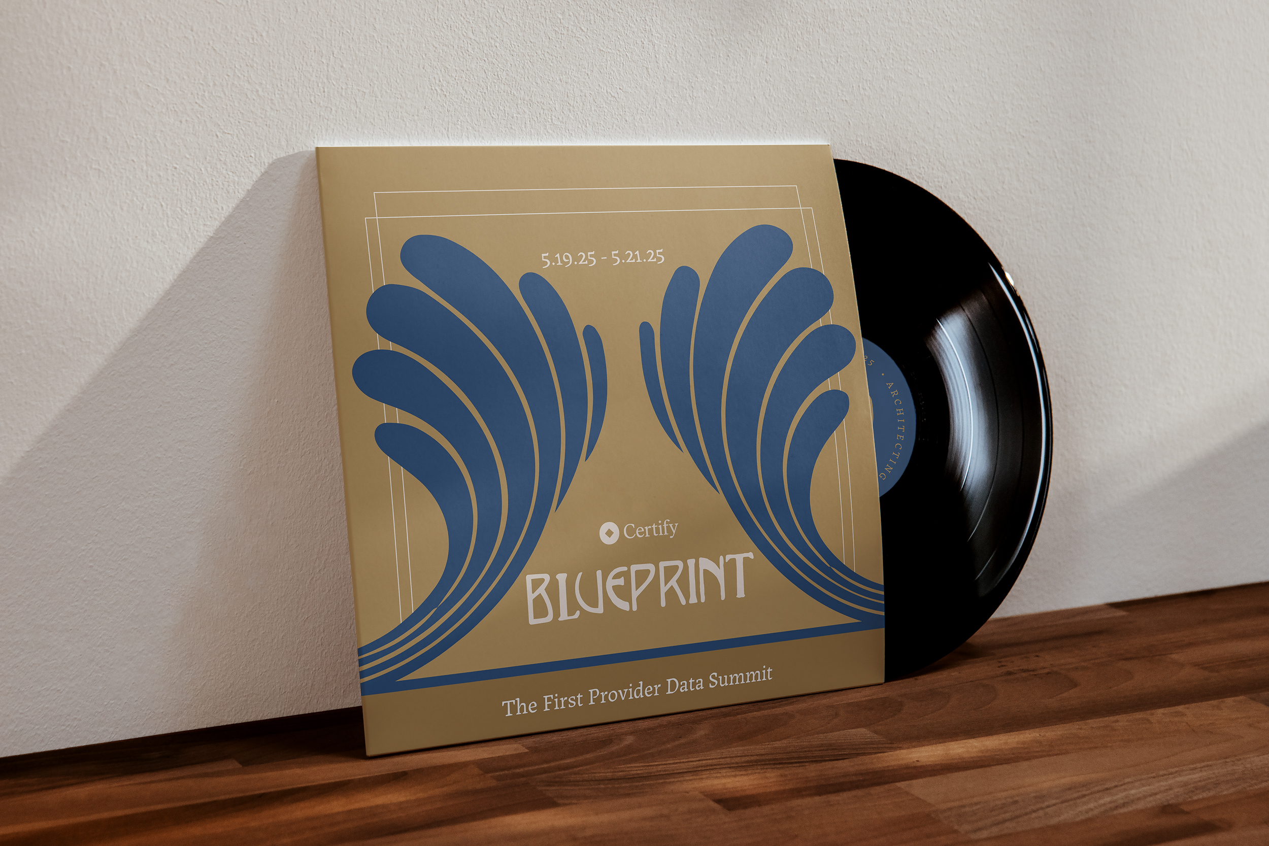
An exclusive room, and no room for a miss.
Before Blueprint had an identity, it had a hard audience and no margin for error. The people in the room are the most senior leaders in health plan strategy — the kind who've sat through every conference template and can feel a sales pitch the second they walk in. Generic event branding wouldn't just underperform. It would undercut the whole premise: that this was a peer gathering worth three days of their time.
The format raised the stakes further. This isn't a booth someone passes in thirty seconds — it's three days in one room, where every touchpoint gets seen up close, repeatedly: the invitation that decides whether someone clears their calendar, the registration desk that sets the first impression, the stage they look at for hours, the program in their hands, the dinner that closes each day. One weak link, and it gets noticed.
So the brand had to do real work before anyone spoke. Read as prestige and trust on sight. Feel rooted in healthcare without the clinical clichés. Carry enough depth to hold a multi-day environment, not a single banner. The problem wasn't making something attractive — it was making senior people feel, on arrival, that they were in the right room.
.jpeg)
02
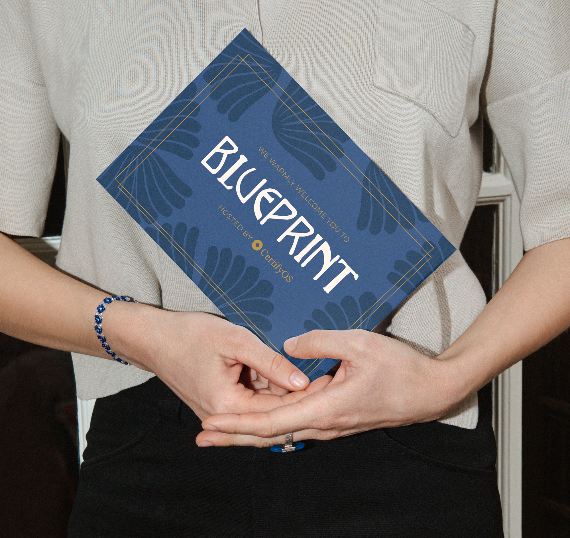
Design the tone, not just the logo.
I built Blueprint as a system, not a logo with collateral hung off it. The visual language leans editorial and restrained — closer to a private members' club or a serious publication than a vendor booth. Considered type, a tight palette, and a tone that told the room: this is for peers, not prospects.
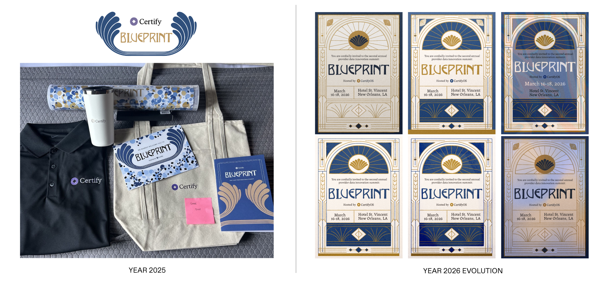
The system was built to extend, because three days is a long arc to hold. The same language ran through the invitation and registration, the signage and stage, the printed programs, and the small environmental details — the things on the table, the wayfinding, the moments between sessions — that make an event feel intentional instead of assembled.
The call that mattered most: building Blueprint to evolve year over year instead of restarting from zero each time. Each edition carries the last one's equity and adds to it, so the event accumulates history and starts to feel like an institution rather than a one-off reinvented annually. As much as anything, the work was designing memory — the artifacts people photograph, keep, and reference the next year, the details that make someone say yes to the next invitation before they've seen the agenda.
.jpeg)
.jpeg)
03
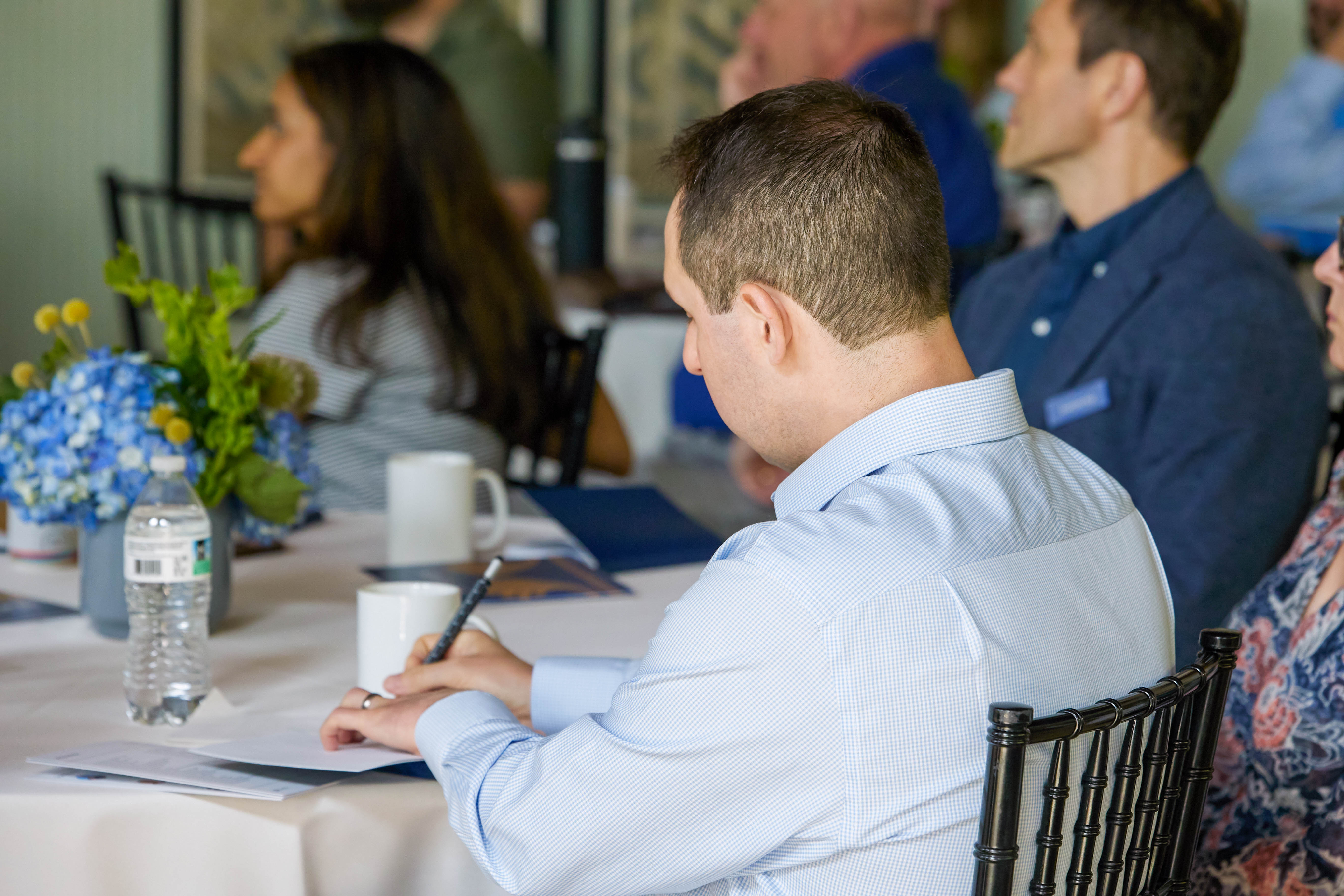
A room that converts — and leaders who return.
Inside the room, the brand and environment that set the tone across three days in New Orleans.
.jpeg)
$28.7M | pipeline represented in the room; $3M | net-new opportunities generated; 9.7 | avg. attendee rating out of 10; 58 | leaders across clients, prospects, and partners
Blueprint needed to feel like an institution, not an event. The brand gave a high-stakes room a tone it could trust — and the experience gave leaders a reason to come back.
.jpeg)
.jpeg)
.png)